This font would be very effective if it was used within a urban thriller film, set in somewhere like London with lots of buildings. I like the boldness of this font and how it is slightly distorted and if we were filming our production in the city I would definitely want to use this within the title credits as it would fit the criteria.
I think this font would work well in a thriller films credits as it is in black and white the audience wouldn't know if it was in fact just ink splodges or it could even be blood. I like the effect this font creates.
This font is extremely bold and eye catching. The thick black letters create an attention grabbing headline and the hand shapes make what would of previously been a boring font into something a lot more interesting.
This font would be excellent in a medical themed thriller or one to do with pulses.
I think this font belongs more in a horror than thriller but would work well in both.
I like the idea of using a typewriter/newspaper font as it related to an idea I had about newspaper credits.
This is similar to a typewriters font but much more messy and therefore slightly more effective to use in a thriller.
This is quite a bold font, it looks like it is from a newspaper headline or something and that would make it effective within the credits, especially if it was used in the title. However I think it lacks character and is fairly boring.
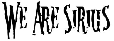
Out of all the fonts, this is one of my favorites as I think it is very effective and I like how it is messy.
This font is very simple yet it works well. The typewriter effect mixed with an old feel produces a successful font outcome.
This is one of the messiest and hardest to read fonts, it looks like splattered blood and running ink and instantly reminds me of murder or something along them lines. Again it would be effective in a thriller but I think it would be more likely to be used within a horror films opening credits.
The font page wouldn't let me put in custom words however I do like this style of font. The way it has been done to look slightly scribbled/drawn but neatly.
This is another one of my favorite fonts, I like it has it relates to the idea I had of cut out newspaper letters being sent to the girl so it would fit in well to the plot and looks very effective as well. It also relates to a sense of mystery instantly because usually cut out newspaper letters have been used within ransom notes etc so this font would therefore be related to mystery thrillers. I think it is very effective.
This font is small, simple and slightly distorted. This makes it successful however I can't personally see it working within a credit sequence however I do like it as a font.


No comments:
Post a Comment