
Showing posts with label Credit Research. Show all posts
Showing posts with label Credit Research. Show all posts
Saturday, 21 January 2012
Credit Experiments
I decided to sit and experiment a little before I made a potential credit draft. I did this to get used to the software and have a look at some of the possible effects and sounds I could use. As a result of this, I am now more aware of the possible credit sequences I can now create. It was definitely a usual thing to do.

Credit Draft Extended
This is an extended version of my credit draft, this time I included some audio using a sound effect template from imovie:
Credit Draft
Using the text we had chosen for our credits I decided to make a very short draft just testing out the impact of the text. This was so i could then analyse how effective it is and see what others in the group thought about what i had done and whether they had anymore ideas relating to our credits design.
Opening Credits
Opening credits commonly include the following names:
- Studio Name.. basically the name of the studio who is distributing the film, and may or may not have been the studio to produce it.
- The Production Company Name.. this is the name of the company that were the ones who actually made the film. So when it comes to our credits we would use our companies name here so it would be something including Sirius, 'A Sirius Production'.
- A Film by.. (Directors Name)
- Starring.. the names of the principal actors. In our credits it will be the names of the girl, stalker and dog walker.
- Films Title.. the name of the film.
- Featuring.. (Featured Actors)
- Casting by.. (Casting Director)
- Music.. (Composer of Music)
- Production Design.. (Production Designer)
- Edited by.. the name of the editor of the film.
- Produced by.. the name of the producer.
- Written by.. (Screenplay Writers)
- Directed by.. the name of the director.
In our credits we are going to include the titles that have been made bold/italic. Although depending on where we get our music from we may need to include that in our credits as well.
Friday, 20 January 2012
Font Idea
I decided to have a quick search for any fonts relating to twigs which would tie in with the end clip in our thriller opening to use for our thriller title in our opening credits. I found one called Gill Tree on dafont.com and despite it being very effective I don't think it would be suitable for our opening as it doesn't strike me as a font that would be related to a thriller however it does look quite creepy.


Alternative Fonts

Reason - The leaf like font relates to a part of the movie where the character Rosie has left a message nearby the abandoned train tracks so that somebody will hopefully find and help her. This is drawn by hand.
MISPLACED
Reason - The bold text stands out making it eye catching to people who what to see a film, it also implies a thriller type film having a serious feel from the text/font compared to different genre of films. This was made using Microsoft Word's font toolbar.
New Font
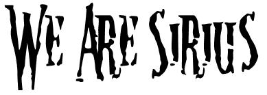
Following on from previous posts I decided that we needed to re-evaluate our options and ideas regarding the style of font we intend to use for our credits within our thriller opening. Personally I believe that we now should use this movie style font as it will be more effective for us to use as it is subtle and adds a sense of mystery to our opening which from our audience research we found our target audience regard as a key element to a thriller.

I believe that this particular font will give us the effect we wish to create and give us a much better chance of having our thriller opening becoming a success as it appeals to an element in which our target audience regards highly and expects to see in a good thriller.
Following on from my own font research and taking into account the massive change in our thriller opening story line and also the research Harry has done, I also feel that this bold and clear font will be a suitable choice as it will produce an effective, clear and well presented opening credits sequence. I definitely believe it is a good, strong font to use.
http://www.dafont.com/movie-letters.font?text=We+Are+Sirius&psize=l

I believe that this particular font will give us the effect we wish to create and give us a much better chance of having our thriller opening becoming a success as it appeals to an element in which our target audience regards highly and expects to see in a good thriller.
Following on from my own font research and taking into account the massive change in our thriller opening story line and also the research Harry has done, I also feel that this bold and clear font will be a suitable choice as it will produce an effective, clear and well presented opening credits sequence. I definitely believe it is a good, strong font to use.
http://www.dafont.com/movie-letters.font?text=We+Are+Sirius&psize=l
Sunday, 8 January 2012
Fonts
Following on from Rubies posts I decided to choose some fonts and evaluate some myself as it will give me a better insight into what we can use in our production. I decided to choose my top three fonts.
Personally i believe this font would be very effective as it stands out, it's very bold and unique. I believe it will definitely grab the attention of the audience, i think it would be most effective in something like a city thriller as the bottom of the text appears to show pieces of potential city skylines. If we decided to film the start of our thriller opening in a city this would be very a very useful text to use for the opening credits as it fits in perfectly.
This text is very different to the first. However it is still an eye catcher nonetheless. This text is far more creative. It looks like some text from an old typewriter, this effect would be great if we decided to add an aspect of mystery to our production.

 |
 |

This particular text is my favourite. It stands out far more than the other two, the effect it creates is that of a creepy one and is much darker than the other two. The way in which it looks like blood dripping down a wall is very effective. This text would be perfect if we were to decided to add an aspect of evil, murder or even just death within our production as it would fit in perfectly and without a doubt grab the attention of the audience.
All three of these fonts are very useful to have a think about as we could use anyone of them within our production as each one presents a different aspect of thrillers.
Fonts
|
| http://www.dafont.com/urban-jungle.font |
This font would be very effective if it was used within a urban thriller film, set in somewhere like London with lots of buildings. I like the boldness of this font and how it is slightly distorted and if we were filming our production in the city I would definitely want to use this within the title credits as it would fit the criteria.
|
| http://www.dafont.com/uncle-typewriter.font |




This is one of the messiest and hardest to read fonts, it looks like splattered blood and running ink and instantly reminds me of murder or something along them lines. Again it would be effective in a thriller but I think it would be more likely to be used within a horror films opening credits.

The font page wouldn't let me put in custom words however I do like this style of font. The way it has been done to look slightly scribbled/drawn but neatly.


Thursday, 15 December 2011
Film Title Ideas
We have come up with a number of ideas for our thriller film title, now we just need to have a group discussion on what we think is best suited to our story line and what we want to portray.
The Unknown / Murder / The Fear Of The Unknown / The Stranger / The Victim / The Letter / The Cry / Missing / No Way Out
The Unknown / Murder / The Fear Of The Unknown / The Stranger / The Victim / The Letter / The Cry / Missing / No Way Out
Saturday, 10 December 2011
Initial Opening Credit Ideas
After researching into a few different opening credits for thrillers I came up with a few initial ideas of my own.
Firstly I liked the use of flash backs a lot, and an opening which isn't very clear, but partly summaries what is going to be shown in the film but not a clear representation until you've watched the whole film then the opening makes sense. I thought about the idea of an newspaper flicking pages in the wind then falls on a certain page and the camera draws attention to certain words on the page such as murder and girl.. so it sets the story line up for the film but doesn't give why it actually happened away. Then the credits would run in a newspaper style with different images on each page, some moving, some photos and then the text in the credits would be in the style of headers and titles in newspapers. I think this would be very effective and could even be related to the story line as it could be about a journalist. This would then fade into an everyday situation leading onto...
I also thought about techniques and fonts we could use.
I also thought about techniques and fonts we could use.
Tuesday, 6 December 2011
Opening Credits Analysis (Se7en)
I decided in order to have some more inspiration for our thriller openings credits it was essential to watch a variety of integrated/superimposed credits in order to see how successful the effects have been created.
The Opening Credits of Se7en.
We watched the opening of Se7en previously and I really liked the way the opening credits were composed. The music used was incredibly effective in creating an atmosphere that is jumpy and it fitted in well with the images and text used. The music also wasn't too loud and overpowering, it definitely wasn't the focus of the opening just added to the effectiveness. Over all the opening was very jumpy, through the use of jump cuts between the credit title names and the images and clips made the whole opening very distorted and not clear at all. I liked how at the very beginning the book pages are being turned as it reminds me of my own idea about newspaper pages turning in the wind. The way the camera is constantly filming close ups and only shows hands and movement around the hands and things which are being used by them such as book text, pens, photos etc. I especially like how you can't make anything out, things such as the sequence and true meaning of it. It makes you question every little jump cut clip as you keep asking yourself if there are any clues within this opening that will be key later on. It also gives nothing away about the film obviously, creating a sense of mystery to the audience which results in them wanting to watch on to see what all this was about. I also love the way the editing has been done in this opening, the way the clips jump cut and fade onto others is very successfully done, and I think it would be a useful technique to do within our thriller opening.
The Opening Credits of Se7en.
We watched the opening of Se7en previously and I really liked the way the opening credits were composed. The music used was incredibly effective in creating an atmosphere that is jumpy and it fitted in well with the images and text used. The music also wasn't too loud and overpowering, it definitely wasn't the focus of the opening just added to the effectiveness. Over all the opening was very jumpy, through the use of jump cuts between the credit title names and the images and clips made the whole opening very distorted and not clear at all. I liked how at the very beginning the book pages are being turned as it reminds me of my own idea about newspaper pages turning in the wind. The way the camera is constantly filming close ups and only shows hands and movement around the hands and things which are being used by them such as book text, pens, photos etc. I especially like how you can't make anything out, things such as the sequence and true meaning of it. It makes you question every little jump cut clip as you keep asking yourself if there are any clues within this opening that will be key later on. It also gives nothing away about the film obviously, creating a sense of mystery to the audience which results in them wanting to watch on to see what all this was about. I also love the way the editing has been done in this opening, the way the clips jump cut and fade onto others is very successfully done, and I think it would be a useful technique to do within our thriller opening.
Opening Credits Analysis (Psycho)
Another set of opening credits I decided to analyse was that of Alfred Hitchcocks Psycho.
 The opening starts with what appears to be a distorted image of the Paramount Pictures graphic. This then fades into black and a very sharp and fast paced credit enters the picture in which a set of black lines stream across the screen revealing Alfred Hitchcock's name, this straight away introduces the audience to the the producer of the film. This is then followed by the same graphic in which black lines can be seen shooting across the screen as the music becomes even more sinister causing great tension as the name of the film "Psycho" is revealed in a bold white text on a black background which makes it stand out and really grab the audiences attention. This is then distorted and more credits are revealed such as actors and other companies involved with the production of the film again with the black lines shooting across the screen and the tempo of the music increasing all the time. Having said this, some credits are bigger than others this could be because some people may be more significant than others and Hitchcocks want his audience to know this. At the end of the credits there is another bold white text graphic of Hitchocks name this time confirming him as the director with the words "directed by" clearly seen on screen. This then fades out as the credits are complete.
Again this will be very usual for our group when it comes deciding our credits when it comes to our opening. This is very different to the credits of "Panic Room" so it gives us another option or path to consider.

Again this will be very usual for our group when it comes deciding our credits when it comes to our opening. This is very different to the credits of "Panic Room" so it gives us another option or path to consider.
Opening Credits Analysis (Panic Room)
In order to create the most effective thriller opening possible we will have to have a very unique set of opening credits as they are a key factor within any thriller, so in order to do this I decided to look at a variety of different opening credits to gain some ideas and a better insight into what makes a good and effective set of opening credits.
In order to carry out this research I used http://www.artofthetitle.com/ to view the opening credits for the film "Panic Room" this was a very useful website as it enabled me to have a real look and analyse why these credits are so effective and the impact they have on the audience.
The opening credits start with a trademark Columbia pictures graphic however the music and sound have been changed, the normal gentle and warm sound has been replaced with much darker sounds such as the crashing of thunder and lighting. This is effective as straight away gives the audience the impression that this film is that of a dark nature. This then fades into black and you can then hear a set of sirens in the background what appears to be an establishing shot of New York, with the first set of text appearing on screen, the text is bold and clear and is also 3D, this is an effective way of drawing the audiences attention towards the credit rather than whats happening in the background shot of the city. this is then accompanied by some very sinister music again giving the audience the impression this film is quite dark and very serious. Following on from this the credits then take the audience on a journey around the city and different buildings within it, each building is accompanied by a jump cut and a different set of credits, whether it be actors within the film or big companies involved in the production. Whilst all this is taking place the sinister music and background noise from the city remains, this is an effective way of building up tension which is something usually associated within Thrillers. Eventually there is a panned shot in which the title of the film is revealed, the text is a lot bigger and stands out a lot more in this shot, not only this but the music becomes much sharper and the tension increases to give the audience a real sense of authority and power. The is a very effective way of titling as it draws the audience into the film straight away. The tour of the city then continues with yet more buildings and credits of companies and people involved with the film however the music is now slightly more upbeat and cheerful accompanied by can only be described as a 'ticking' sound.
Personally I believe as a group we can take a lot from this, we can analyse what Panic Room did well and how effective it was in drawing it's audience in making them feel apart of the action from the start.
Thursday, 1 December 2011
Red Road Credit Research
Red Road could be seen as an example of a low budget film. I decided to look at one which wasn't seen as a typical hollywood thriller film and would be slightly more similar to the one we would be making as we don't have a bugdet for our film and I came across this one. Initially I thought it was a low bugdet film but after some more research it became obvious to me that depite winning an award for being low bugdet it actialy cost 1.3 milion to make and produce so I don't think I personally can class this as a low bugdet thriller. I do however especially like the opening titles in this as it is very realistic so we could come back and look at this films titles when we need inspiration for our opening titles.
Subscribe to:
Posts (Atom)